Victorian Homes of the Mission District
September is Architecture and the City month in San Francisco, and the AIA has lots of fun architecture events planned. I usually try to volunteer for a couple of events in addition to going on tours and attending lectures, and when I saw this walking tour on the list I signed right up. (Walking tours seem not to be as popular with the volunteers.)
We started at the corner of Bartlett and 23rd, a nice quiet street corner. I'm not going to remember the route we took, so instead I'll try to tell you some of the takeaway information from the tour. And lots and lots and lots of photos. I originally tried to keep them in order so you could sort of follow along on the tour, but scrapped that for a better story. So if you know the Mission, this will seem like we walked back and forth all over the place, when in fact we made a fairly orderly progression.
So.
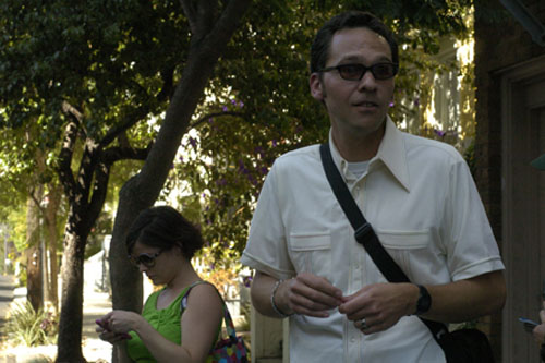
First, this is Jonathan Lammers. He was our tour guide. He's a historian who works for Page & Turnbull, an architecture firm. He did a historical survey of the Mission for the City of San Francisco (this will eventually become a public document, so start stalking the Planning Department web site now), and shared much of his knowledge with us on this tour. He had a lot of insight into how the city operated before much of it was destroyed by the 1906 fire (including all the building records, which is why we need to do surveys and forensics to know when buildings were built here).
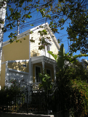
Let's start with a bit of history. Before the Gold Rush, San Francisco was a city of about 10,000 people. Afterwards, the population was more like 100,000. In addition, a lot of property changed hands, and they basically had to grant a bunch of people squatter's rights to the places where they were living because the courts were so backed up.
Some of the oldest surviving houses in San Francisco were these simple gabled farmhouses. For the most part they were in the area that is downtown these days, and as land got more valuable there, the houses would be sold and moved outside the city (the Mission was not even part of the city at the time). This house is probably from the 1860's.
The first Victorians were these flat-fronted Italianates. They tended to be, as this house is, set back from the street somewhat to make a front yard, with a little wall to mark the end of the garden (more on that in a second).
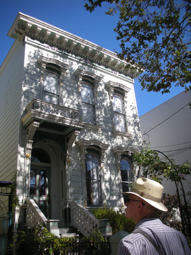
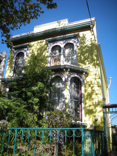
The older houses in San Francisco are generally smaller. As houses aged, they were often moved into the back yard, with a newer, bigger house built in front. Many of these older homes survive in back yards today, invisible from the street. As for all the house moving, it was more common back in the day when labour was cheaper than materials, and there were not as many overhead wires.
The bay window began to show up on San Francisco homes as a lower-story bay. Later it would be extended to reach to the roof. This house is clearly an early example of the bay window.
(The origin of the term "bay window" is not quite clear, but some sources point to the use of the window in the Massachusetts Bay Colony, while others say it is called that because of the City by the Bay -- San Francisco. I hold with the Massachusetts story because the earlier settlement seems a more likely source.)
The major difference between this streetscape and what would have been here 100 years ago are the trees. Here we have another small, short Victorian, with a bay that doesn't reach the roofline, set back from the street -- all signs of an older house. What it would not have had is the large, mature tree in the front garden.
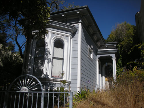
This is what San Francisco houses used to show the street: a little stone, brick, or concrete wall with an iron fence on top of it. These mostly got knocked out to make driveways, and now it seems like only one in ten houses has such a nice little wall.
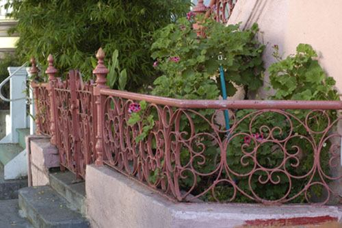
The metalwork is of varying quality. You can see this iron is handmade, and it looks to me like a modern replacement (because it's in such good shape).
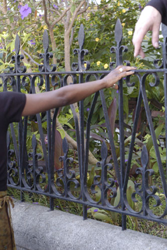
The little wall makes the front of even a slumlord special look nice.
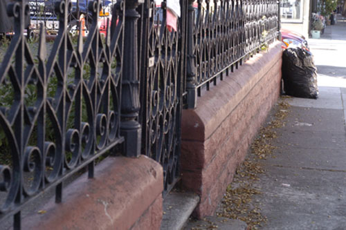
Above the wall, you would have something like this. These houses are a few blocks from the fire line from the 1906 fire. They date from the 1860's. They are flat-fronted Italianates, one flat at ground level, and one accessed via a steep outdoor stair. Many of these houses have been raised, as you can see the far house was, to accommodate a full-height lower floor or a garage.
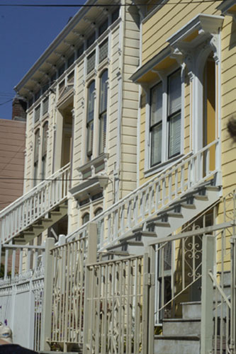
The other thing that started disappearing as the car came into the city were stable blocks. You can see the carriage houses in the back yards of these houses still standing -- they've been converted into housing, of course -- but many of them were knocked down or moved elsewhere.
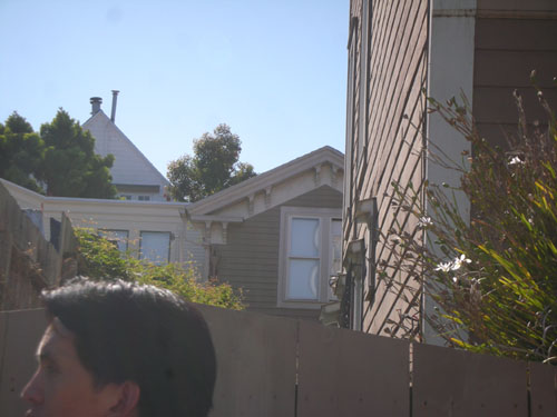
These houses were built as part of a huge multi-block development. This was a smaller, side street, so the houses are smaller and less ostentatious. In this shot you can see the false fronts (everything was spent on the street facade).
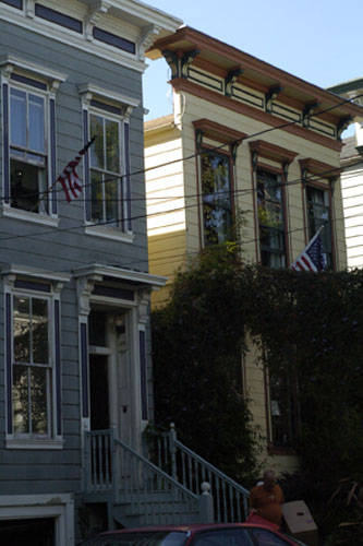
It's interesting to see that on some streets, the houses are literally wall-to-wall, whereas in other places, like this little side street, there's a foot or two between the houses. It's not much space, but maybe it helped sell the smaller homes on the quieter street (can you imagine a world where that was a negative?).
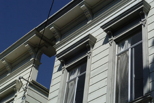
In contrast, these houses on an alley were clearly built for working-class families. They are tiny, tiny places with a lot less ornament. They've been raised to make garages, but were originally even lower.
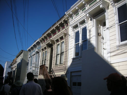
You can see that the doorways are narrow, and they probably originally had two rooms and a lean-to kitchen off the back, and that was it. The back room would have been the family bedroom, while the front room would be the parents' bedroom and the sitting room.
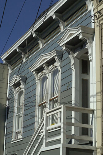
San Francisco is in many ways a very conservative city. Even newer buildings are designed to look much like houses built 150 years ago.
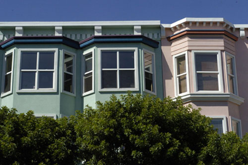
These houses are Edwardian. The style is very similar to the Victorians, but slightly less ornate. The fire in 1906 ended right where I was standing when I took the picture. The houses that had been on this street were razed to make a fire break.
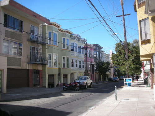
The classic Italianate row house that is so rare in the East Bay is common as dirt in the Mission, at least once you get past the fire line (they dynamited whole blocks of houses to serve as a fire break, so there's a point where the pre-1906 construction completely disappears). This house was on the other side of the street from that fire line.
One of the things that defines the San Francisco Victorian is the lot width. San Francisco's lots are based on a division of the Spanish vara, and end up about 25 ft wide (by 100 to 120 ft deep). That forced the verticality that you see on houses like this. That proportion seems to have spread out from San Francisco, because we have 25 ft lots in Alameda, as well.
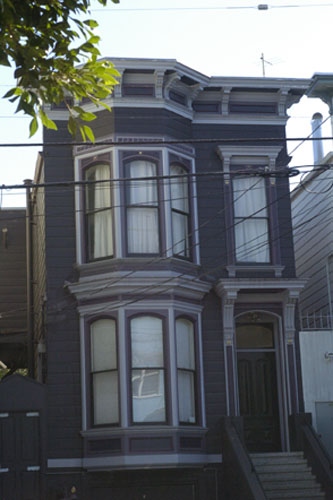
More about the fire. There's something about losing most of your city in a blaze that makes you a little touchy on firefighting. This curve of bricks denotes an enormous cistern under the street, full of water to be used for firefighting. It's still in use today.
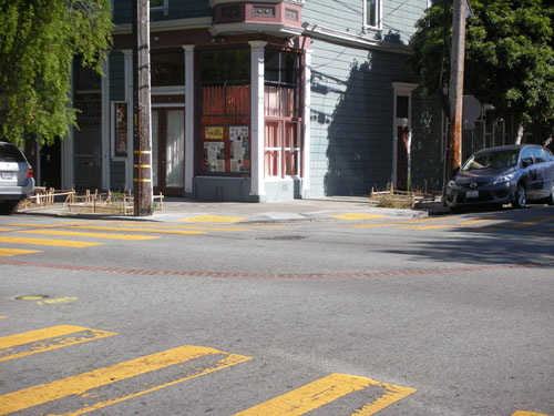
Fire has shaped the city in many ways. This Queen Anne house lost its roof in an attic fire, and the owners elected to just put in a flat roof as a replacement.
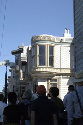
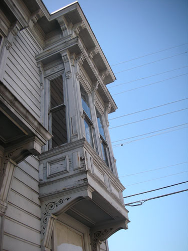
This house is being turned into a museum. It's a lovely Italianate, about the same age as our house. It had a lot of the same details. The shutters are like what was on the house originally.
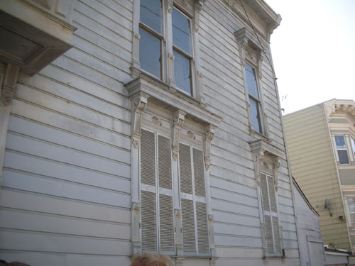
It had two boxy bays (unlike our 45-degree bays). I love the brackets that support the cantilever.
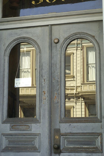
And here's its front door. The shape of those arches would put the door later than the rest of the house for me, but of course all kinds of stuff was available and people used a bit of everything.
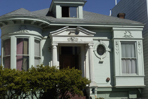
Like the guy who built this house, who owned a mill that made stock parts for houses. Apparently this house was like an edited catalog. If I owned it I would paint all the parts crazy colours and highlight how discordant it is.
One thing I love seeing in a city is a lack of fear of modernism (so rare around here). This newer development (perhaps only 10-20 years old) sits right across the street from more traditional homes.
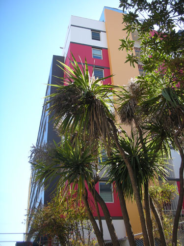
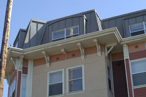
This is a modern development, as well. I love how they've tucked the upper story into the mansard roof. While most of San Francisco was designed to look like London or New York townhouses, this echoes Paris.
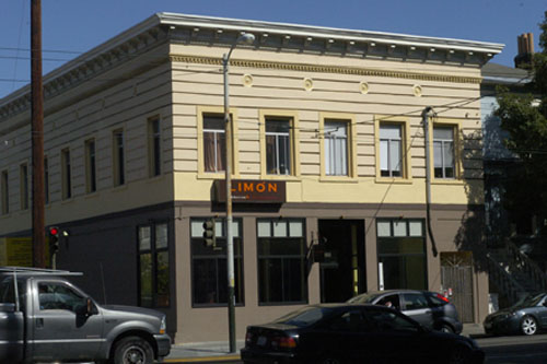
This style of commercial building was built for over 50 years in basically the same configuration. You find them all over San Francisco at street corners. Even where they burned during the fire, they were rebuilt afterwards pretty much the same. This one is a Peruvian restaurant.
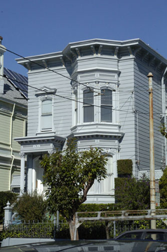
As we walked, I kept seeing this: Italianate houses that could easily be confused with our own. This one is designed to hide the roof, which is why it has such a top-heavy look to it.
There are later Victorian homes, of course. They always look so crazy compared to the simple lines of the Italianate, but I'm kind of biased.
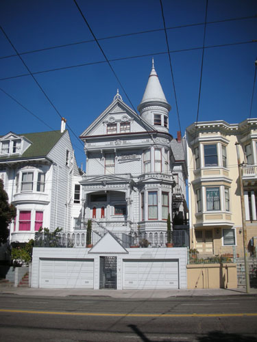
This house looks like it's wearing a huge, out of scale hat. I love the little round window in the attic.
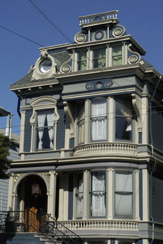
One of the modern myths about housing is that single-family houses were normal or even attainable for most people. The reality of the San Francisco Victorians is that a lot of them were built as multi-family housing from the start. You can see that in these duplexes:
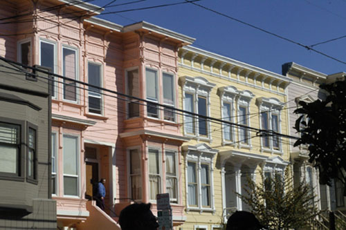
And even in this posher duplex. (Keep in mind that relative poshness is the current state; these look to have been houses for families in the same economic condition when they were originally built.)
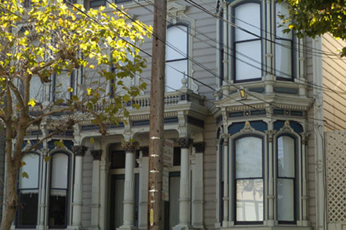
These are 1880's row houses, once hailed as a lovely example of composition and form. They have very narrow doorways, which would allow a narrower facing on the street.
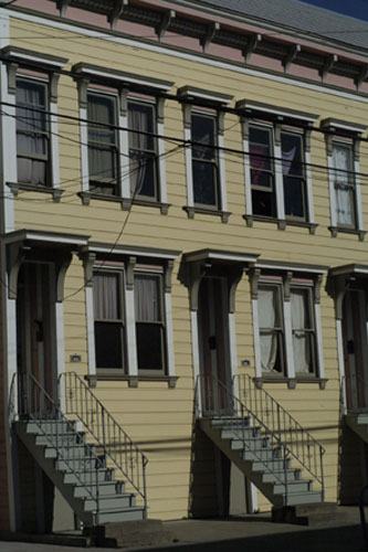
One of the things you see in more detail as you walk and look at a lot of homes at once is how change shows itself on the facades. These owners used an interesting technique to add more windows for an attic pop-up:
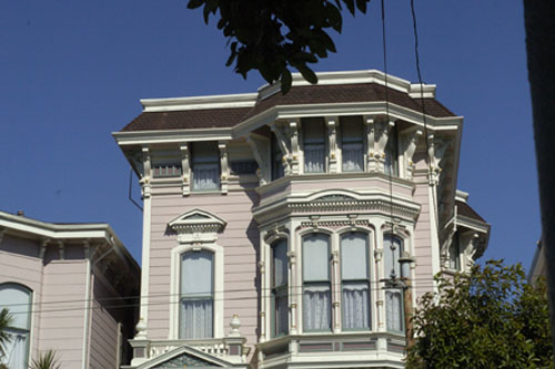
This lower-rent house replaced their original windows and ripped off the trim, but painted the form of them onto the house.
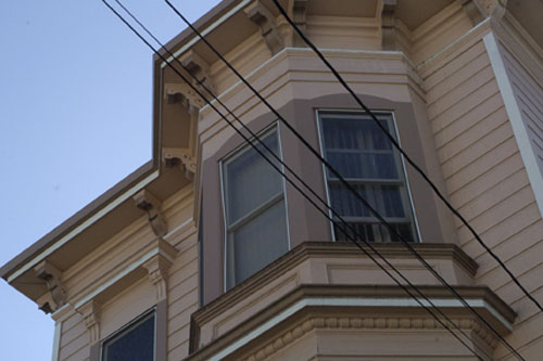
And this is what happens when the city regrades the street in front of your house to be several feet lower than it had been. San Francisco is known for its hills, but the Mission district is actually pretty level.
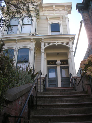
And more changes over time reflected in facades. This row of houses was developed by Baroness von Schroeder. At one time they were identical, and lower, with peaked roofs. You can see one near the end that has been redone in the Mission Revival style, one nearer that has asbestos shingles. All of them have been raised to add garages.
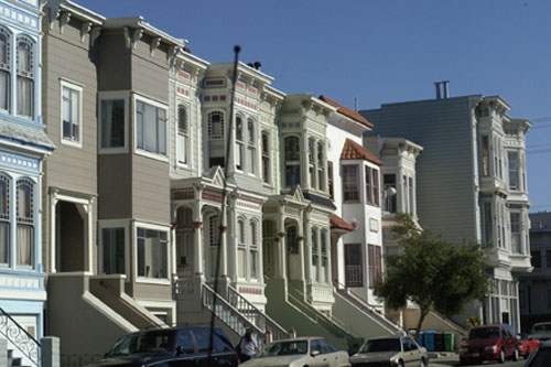
This is looking the other direction on the same street. These houses have the original peaked roof, but one has been modified to be taller than the other, maybe to accommodate an attic.
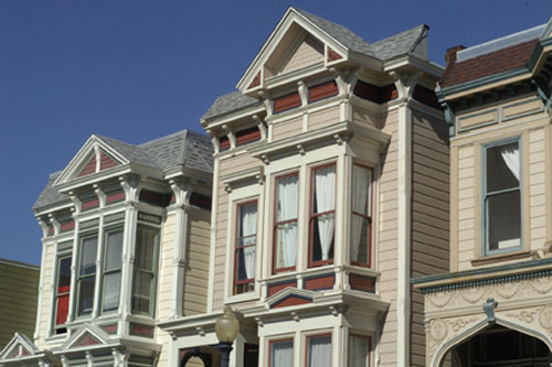
It's pretty typical to find houses that have been raised to make room for a store or garage on a lower level. You can still see where the original front door was on this corner house.
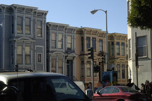
And here's a funny little tidbit. See the little yellow peaked house on the left there? They literally lifted it and put the store in underneath it. That house is one of the oldest in San Francisco.
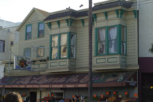
You can also see how this house was raised to make a storefront below. (They also added on that bay on the right side, sometime in the 30's.)
This picture also shows a major shift in the demographics of the Mission. First the Spanish came along and built Mission Dolores to convert the local Indians. Then as San Francisco became a city, the area was settled with Germanic people and Poles. This church was a German Presbyterian church. Now those groups have moved on and the Mission is mostly Latino, and the church is a Buddhist temple.
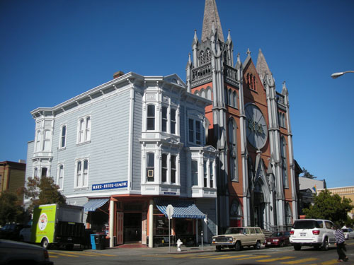
More change: at some point, they cut this duplex in half and moved each side to the edges of the lot.
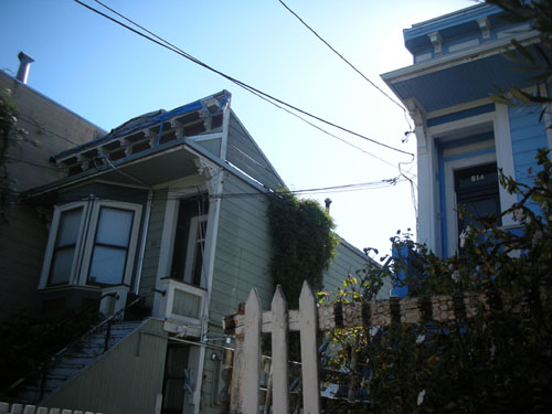
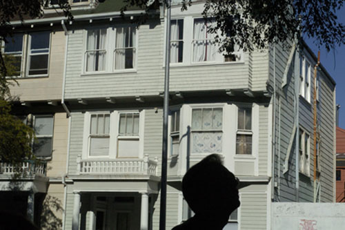
Architecture doesn't stop, so we find houses like these Arts-and-Crafts multifamily homes wedged into what had been vacant lots.
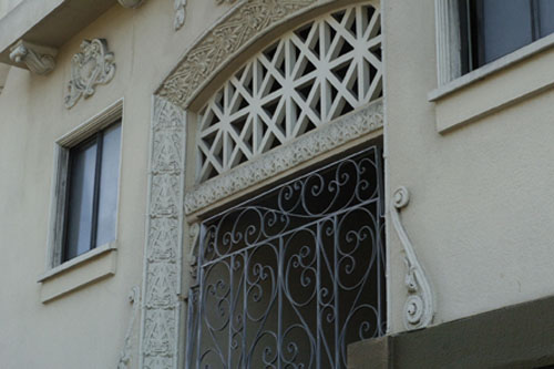
And this Deco ornament on a much larger prewar apartment building.
There are tons more tours during Architecture and the City month, including the showcase two-day home tours. Check it out.
And one fun photo. Before I went on the tour I stopped by the main branch of the library and got some books out. When I was leaving, I saw how it is that they clean the pigeon poop off the statues.
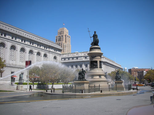
That looks like so much fun.
Technorati Tags: architecture, san francisco, victorians
posted by ayse on 09/03/09