Some Other Italianates
The other day Noel and I took a walk around a neighborhood near Cathedral Hill in San Francisco, looking at other examples of Italianates (and other Victorians).
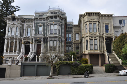
What we were looking for (well, apart from a little house-gawping which is fun on its own) were original facade treatments. We've been talking about doing some major work on the side porch in our Copious Spare Time, and I'd like to make the roof look less 1950's and more 1870's.
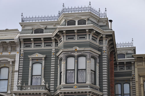
This house has a really interesting roof: they have small windows into the attic which would be really nice for working up there (I know normal people don't spend a lot of time crawling around in their unfinished, filthy attic, but we do), and I love the little railing at the roof edge that looks like a little crown.
The other thing we continue to discuss is how to best paint the house once we get past plain gray. I like the judicious use of gold leaf on this house, but mostly I like the many shades of gray and how the trim gets picked out.
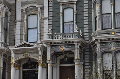
Another close-up: the little decorative railing over the front porch on that house is heavier, which works really well against the front of the house. Our little front porch decorative railing is ugly and in very bad shape. I'm thinking something like this would work better. We don't have any original photos of our own house so we'll have to work with examples of other houses from the same period.
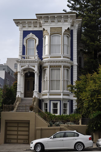
Here's another dramatic house. This one is a little newer than ours (those rounded windows -- such a pain to replace -- are more Queen Anne but the verticality is all Italianate). I love the saturated blue paint on this house but it's a hard colour to work with.
An interesting thing about this house is that you can see that it was raised to make room for the garage -- those full-height windows in the basement are definitely not original. Raising houses to make room for garages was very common in San Francisco around the turn of the century, because suddenly a lot of people were buying cars. Those garages don't always work very well with modern cars, though, and these days the city won't just let you change the height of your house.
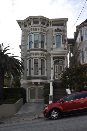
This house is a nice example of a well-done garage. They've been helped by being on the hill, so the garage didn't require them to raise the house too much. I also love the paint job on this house.
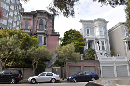
In contrast, these houses were raised, in my opinion, too much above the street. The other possibility, of course, is that when they regularized the streets, they had to lower this one so much that everything on that side of the street is way too high. I
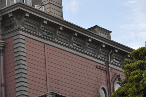
On this house, the attic seems to be lit with little tiny edge windows. One of the challenges of adding windows to non-habitable spaces is that the city will often assume you are trying to make non-compliant living space, when all you want to do is make it not quite so horrible to find roof leaks or faulty wiring. This is because the people who work for the city generally think of houses for things to just live in, instead of as massive ongoing projects.
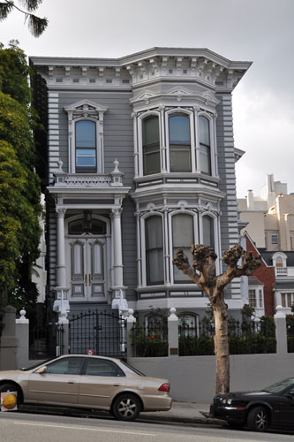
This is the Sloss-Lilienthal House. It's a historic house, built around the same time as ours. It's got a lot of nice detail.
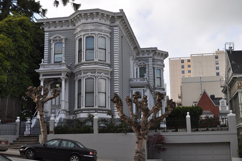
I took some more detailed photos of their side porch, but this one shows it to you in context. This house has much the same configuration as ours, though they have a full upper floor (ours is only 2-story in the front; this one is all 2-story), and I think this is quite a bit larger in footprint.
They also did a nice job of putting a garage in here: it's under the terrace they've made there. I wonder if they have problems with water intrusion down there: it certainly seems like that would be the case.
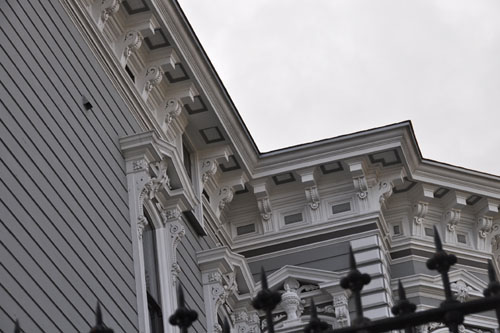
The Sloss-Lilienthal House also has little attic windows hidden in the cornice.
As a side note, I like how the paint at the soffit there adds texture to the all-white cornice. Just a few spots and the house looks much more interesting.
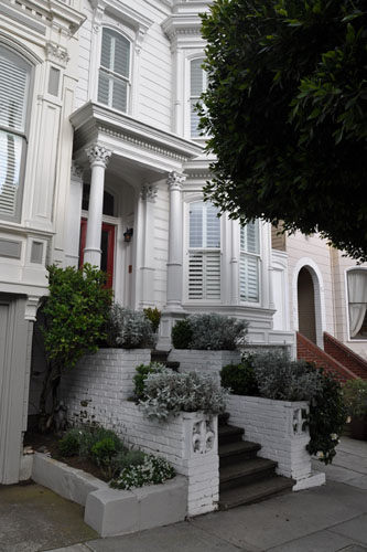
Another house, this one harder to photograph because of the enormous tree in front. Plain white was the most common original colour scheme for these houses and continues to be very popular. But on this house what I love love love is the brick planters at the sides of the stairs. If our stairs were not intact-ish I'd be tempted to give this a try. As it is I'm reconsidering the configuration of our side stairs (to be rebuilt this summer) now.
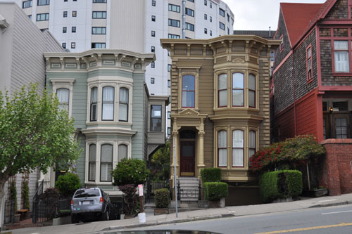
Sometimes the only way you can tell that a detail is original is that it is repeated on several other nearby houses. A lot of streets were developed as a whole by the same developer, and the houses are generally duplicates. So when we saw this enormous cantilevered bay on the minty-green house here, we assumed it must be a modern add-on. Only, the mustard-coloured house next door had exactly the same bay. Original. Wow.
(You can also see that the trim on both houses has been modified over time.)
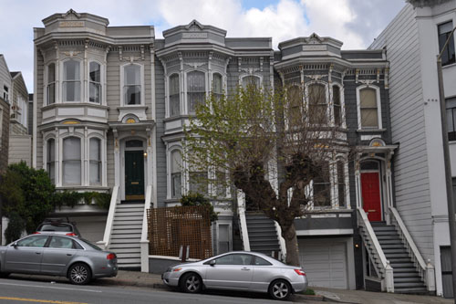
Here's another trio of houses. I had an interesting talk with a specialist in historical restoration who told me that you do have to be careful about always assuming repeated patterns are original. Sometimes the same detail will be picked up by the neighbors later so the houses will "match." In this case all three houses were raised, probably originally to put garages in. Then the middle house probably converted that garage to living space because it was impractically narrow, or maybe because they wanted income from a rental unit more than the parking space (it's a little hard to see here, but there's a door behind that screen).
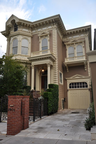
Not terribly common in San Francisco, where houses were usually built right up to the lot line, is to add on to get a garage. This house has done a nice job of that. They also have a window in the attic, visible at front. This one is on a massive lot, with a huge garden, so obviously they had plenty of room for a garage when cars came into vogue.
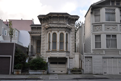
And here is a particularly bad garage addition. Half the problem is that the proportions of the house are just off. This was a common complaint about these houses when they were built (those people who hate McMansions now sound an awful lot like critics of Victorian houses in their day), and this one is a particularly good example of the problem. There are probably things you could do to make this house look more elegant, starting with a new paint job and doing something about the trim around the hideous garage door, but without completely rebuilding it it will always be what it is.
Now, I happen to kind of like lumpy weird things. And I guess the thing now is to like lumpy weird things that are old. But it would be hard to argue that this house is the pinnacle of elegance in design.
Also, note, this house has a lot of the same details as ours, on a shorter scale. This was definitely a less-fancy house.
Next post: Man's inhumanity to houses, revisited.
posted by ayse on 04/14/13