How to Design a Kitchen: A Lengthy Rant About Cabinets
One part of my current job is putting together cabinet orders.
In addition to doing design, my firm also sells some products. It's a win-win: we get a bit of a kickback on the products, and we can offer our clients a lower price on those products. I've been training our design assistant to do the orders, too, but every month I put together a few full kitchen quotes, and I work with our designers on staff to make sure their cabinet designs make sense and will work with the client's budget.
And I have opinions. Lots of them. About cabinets and about how people approach kitchen design.
Opinion the First: I HATE corner cabinets.
Corner cabinets in kitchens are just a mess. You either have a strange cabinet there with a tiny little door that means nothing particularly large can go in there, or you can choose one of a number of marginal "solutions" to using that space:
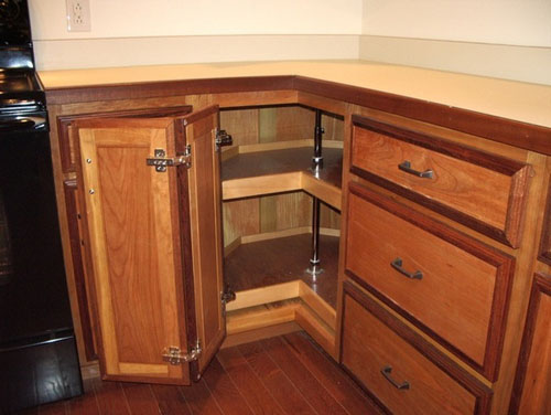
You have the lazy susan, which you better not overload or stuff will fall off the back and you'll have to empty the whole cabinet to get at it. Plus, it has a fixed size because you're using hardware to solve a problem, and you have a lot of unused corners.
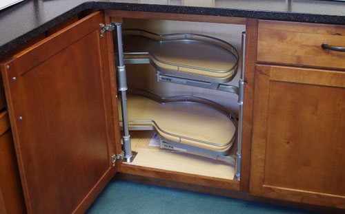
You have a piece of hardware I call The Peanut, which is for a blind cabinet (it doesn't turn the corner, but just goes back into the corner and fills it), which has the same problems in a different shape. This one pulls out, though, which is why it has this crazy shape. Because the hardware is manufactured in mass, you are stuck with one cabinet size that will work for this.
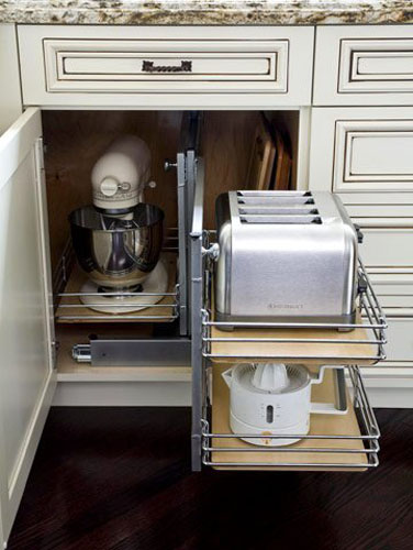
This one is another pull-out device that gives you a couple sets of shelves to store things on. It's popular with our clients, but it has the same issue, which is that stuff falls off the shelves and you end up emptying the cabinet to get that one blade for the food processor that fell off the shelf and got jammed under there, keeping the shelf from pulling out all the way. Bonus for how they styled it for this photo with a bunch of cutting boards right where they would keep you from being able to put the whole thing back in the cabinet and close the door.
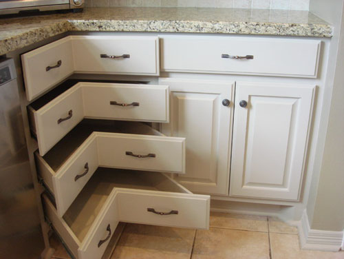
This particular cabinet is all over Pinterest and is very popular with clients on initial meeting but gets scuttled because 1. it is pretty expensive with all those drawers, 2. there's actually quite a bit of wasted space there, and 3. it also requires a lot of space in front of it to open fully.
Some people like to use the corner for trash like so:
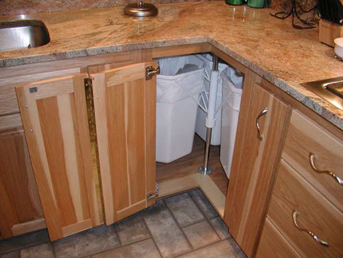
But I find that arrangement is hard to clean.
My preference for corners? Design them out of the kitchen. Either reduce or minimize the number of corners in the kitchen layout, or where possible give access to the blind space in the corner from the other side, like at a breakfast bar:
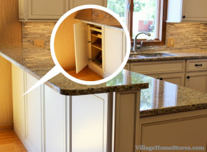
(See it in context here.)
This can be worked pretty neatly into a peninsula design either with a panel that looks like the cabinet door, or by using a slab cabinet door and a push latch.
If you must have a corner cabinet, I generally try to steer people towards simple shelves. Things are still hard to get to, but at least you know they're going to be hard to get to so you only store rarely-used items there, as opposed to fooling yourself into thinking they are readily accessible and constantly tangling with the pull-out or lazy susan setup.
Opinion the Second: Very specialized cabinets are a waste of space
Oh, people love the specialized cabinets. Every time we do a kitchen it seems like the client has at least one cabinet in mind for a specific use. Like this one:
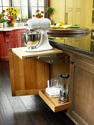
This is a mixer cabinet, and this photo has a big lie in it. Can you see it?
The lie is that you can't have anything that big in that lower pullout. I've actually only seen these lifts installed alone in a 24" wide cabinet, rather than like this with a pullout below them, but I guess you could do that if your mixer is not too tall. You would only be able to store flat things in the pullout, but OK.
But NOT OK. That's a huge amount of space to dedicate to just hiding your mixer from view. These cabinets cost hundreds of dollars and the lift is not cheap, either. And these lifts are not even that great: they are hard to use and don't feel particularly safe. I tried one out at a demo one time and it felt like the springs were trying to fling the mixer into my face. And look at how much more of that cabinet that mixer is using than it really needs. You could store all that stuff plus a bunch of other things if you just had a couple pullouts in there. You'd need to lift the mixer onto the counter yourself, but if you must put the thing out of sight when it's not in use, that's on you.
Or check this one out:
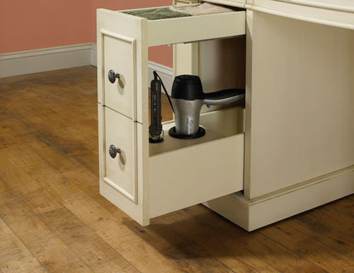
Maybe I just don't appreciate the real utility of this cabinet, because I look at that and think I could have a couple of useful drawers with more real storage space in them in place of the space that one hair dryer and curling iron are taking.
I feel similarly about this:
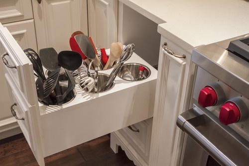
We actually custom-built one of these for a client. I don't get it. A stack of drawers in the same spot would hold the same things in less space that is more easily cleanable.
And don't get me started on appliance garages.
Opinion the Third: Appliance garages are a waste of your cabinetry money
Keep in mind that cabinets are not free. Just building a an appliance garage costs hundreds of dollars. For that kind of money I want to see a cabinet really help make your kitchen work. Instead, you get this:
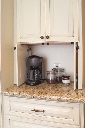
I'm not sure why those doors are necessary? I mean, look at the aesthetic of those cabinets: they have the glazing and faux-aging that is very fashionable in the traditional design market, where kitchens are supposed to look artfully cluttered and well-used. You've got a busy granite countertop. Closing those doors is not going to make this space look cleaner and less busy. And how often and when are they actually closed? In most houses, that would be never. So you've paid hundreds of dollars for a cabinet that never really gets used AND takes up counter space all the time.
Or here:
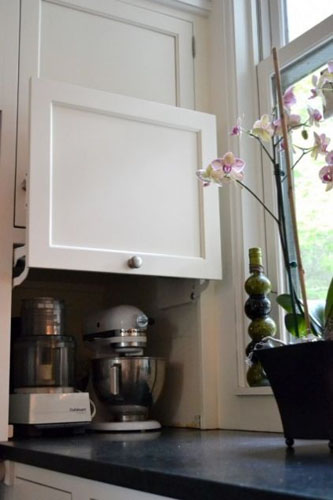
Where the door just makes it more complicated to get things to a place where you can use them, since you can't use either of those appliances without moving them (possibly both of them) first.
I'm sure in an ultra-modern kitchen there's a place for smooth panels that slide into place to hide appliances and so on, but you almost never see appliance garages used in those situations. In ultra-modern kitchens the appliances are usually chosen to fit seamlessly into the space, rather than this sort of awkward concealment of ugly things (or things somebody thinks are ugly; I'm quite fond of my Kitchenaid mixer, myself). It's always a very traditional or traditional-transitional kitchen where designers pull out this trick. I don't get it.
Opinion the Fourth: Built-in food storage containers always end up being gross
As somebody who transfers bulk goods to carefully chosen glass containers for both utilitarian purposes and for aesthetics, I get the custom containers thing. I'm not 100 percent behind it (coming up in a sec), but I get it. What I do not get is this:
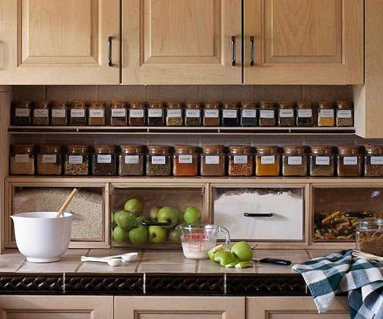
The same kind of container does not work for storing both fresh apples and things like flour and oatmeal. In fact, this kind of container doesn't work for either, though I will give you that the apples were probably put there by the photographer as a styling thing.
But here's some truth: those plastic drawers are useless. They don't seal, and they will be difficult to get clean. Those dry goods will be full of nasty bugs in a very short time. I look at things like this and remember the feeling I got looking into a flour bin and seeing grain moths for the first time. It is not a good feeling.
Similarly:
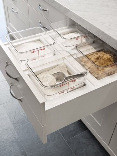
Let's hope that they just took the lids off for the photo, right?
Is there any reason why this drawer needs to have a special divider thing to hold those containers built into it? They do sell perfectly functional peg systems to hold items in place, and what if you decide you want a larger container for one thing and a smaller for another? Are you never ever going to change your mind about how you run your kitchen? How do you even clean the flour that inevitably falls out around the container?
Opinion the Fifth: Nobody is going to rebottle all their spices forever
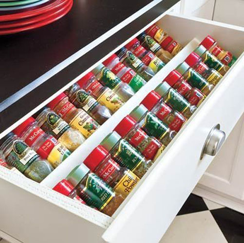
Love it. Hope you never need to buy a large container of parsley flakes or anything. May all your spice jars be the same size forever. (I hope you appreciate how the photograph was styled to have the brands of spices alternate, even though the arrangement of jars makes no sense and there are a lot of repeats in there.)
Opinion the Sixth: Wide shelves sag under weight
I'm trying to break the designers in my office of the habit of designing really wide cabinets. Sure, they look super sexy and expansive, but there is something you should consider: EVERYTHING YOU PUT ON THOSE SHELVES HAS WEIGHT.
The stuff in a kitchen is some of the heaviest stuff in a house. This:
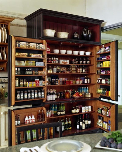
...is going to sag very unattractively, and it's already started. Those shelves are at least 48 inches wide and yet only 3/4" plywood at best. They are not even loaded and you can see a slight sag to them. Fill those up the way they inevitably would be in a real kitchen and they will have a real bend in them right away. Over time they will start emptying their contents onto whoever opens the cabinet doors.
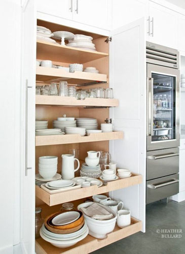
Even worse, try this one (originally from here, but passed around all over the place). Do you think that pullout is built to stand up to that kind of weight? Not the draw guides themselves, which the author says are for commercial equipment, but the shelves (which, being wood, are clearly NOT for commercial equipment). For a cabinet like this I would typically limit the width to 30 inches at most. Based on the refrigerator this is next to, this is another 48 inch cabinet. Most cabinet companies won't warranty a cabinet that wide with pullouts for good reasons.
As better idea: you could put a divider down the center of the cabinet and have narrower pullouts or shelves on either side. Then you could also have different heights and maybe store things more efficiently, too.
Opinion the Seventh: Cabinets cost money, so make them worthwhile
We got kind of excited in my firm when we found a cabinet line that carries these toe-kick drawers as a non-custom option.
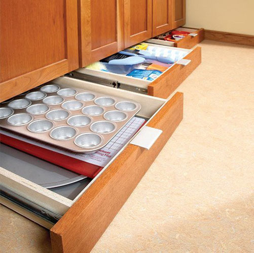
Yeah. So how much does that option cost? A few hundred bucks PER CABINET is how much. Unless you are in a minuscule kitchen, the extra storage space is hardly worth the extra cost. They can only store a limited number of things because of their dimensions, too. It's a great idea, but in the real world these things cost money, and you need to decide where your money is best spent.
Opinion the Eighth: Some things are just a bad idea
Knives at eye level would be high on that list.
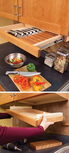
I mean, really. Who is so desperate to find a hidden storage space for their knives that they think this is remotely a good idea?
This is another stupid idea:
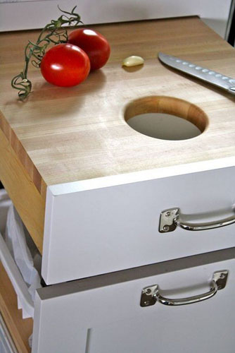
I get why a hole in the cutting surface is so great -- although I disagree with the idea personally because I don't like cleaning things like this -- but even if you are all-in for washing the underside of a pull-out shelf every time you use it, this doesn't work because the hole is right where you would want to be doing the cutting. It is a mistake to get so wrapped up in the clever solution that you lose sight of the basic function of the cabinet.
And finally, not an opinion on cabinets, but a comment on the styling in this shot: what is happening in this household that they need this particular arrangement of devices?
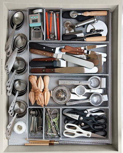
"Oh, we make a lot of lemon meringue pies."
"But every Friday we have homemade pizza and cut out paper dolls! We know how to party!"
posted by ayse on 08/13/15