Whole House Lighting
There's something a little overwhelming about choosing lighting for a whole house. Almost none of the light fixtures we had for the house were going to be reusable for a variety of reasons, some of them just aesthetic (I really wanted to replace the cheap dining room chandelier we got at Home Depot) and most of them technical (putting them in would require a different kind of connection so later replacement would not be viable or would cost a lot of money). So I resigned myself to buying a ton of lighting.
That's the thing: I love looking at lighting catalogues. I love to flip through and choose pictures of lights I love, to daydream about them. But the reality of lighting a house is that a couple of things come home to roost:
1. We are not made of money and it is not one of the things growing on trees in the back yard, so I need to stop drooling over $5000 fixtures and get down to business, and
2. Everything really should work together, so there aren't three magnificent, unique, show-stealing fixtures in one room, because that looks like you are trying to wear three hats.
So with that, I made a (private) Pinterest board and got to work trying to get lights for the whole house that are nice, not ruinously expensive (lighting is expensive, but there is a shallow end), and work together.
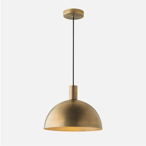
I started with the pendants for the kitchen island. I showed you my elevation of the space recently, and finding the right fixture for it was a little tough. My requirements were: large enough to make a statement in the space, some way of looping it up out of the way when we move the island for whatever insane reason we have for moving the island, simple enough to not be overwhelming, and brass, because I wanted to pick up the brass elements elsewhere in the kitchen.
These Shelby pendants from Schoolhouse Electric are made in Portland, and while the 14" canopy width is not quite as dramatic as I wanted (I was looking for 18"), they have nice lines and I like the little cylinder movement above the dome. I paid for extra length on the cords to bring them down lower over the island: with 60" cords the lights are still more than 6' off the floor.
We also chose a single pendant for the bay window in the kitchen, which will drop over the small table we will put there (when we have that small table, which we do not right now):
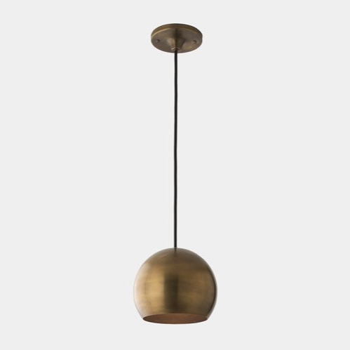
This is the Isaac pendant, also from Schoolhouse Electric. Simple, clean lines for a room that has a lot going on. Because we also have recessed LED can lights, there will be a lot of other light in the room and we don't have to worry about the solid light shades making a dark hole above at night. Again, extra length on the cord for the high ceilings.
So that was the kitchen. I then focused on the parlours, because they are connected spaces and also the most traditional rooms in the house.
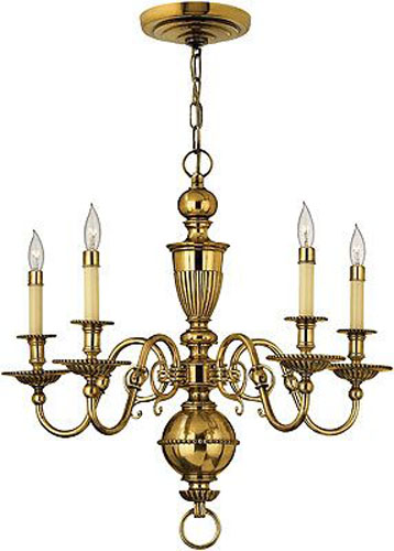
This is the Cambridge chandelier from House of Antique Hardware, which will be in both parlours. It's a fairly simple chandelier, and we can use little LED flame lights instead of the incandescent ones. I don't want anything too fancy in these rooms but I did want to have something nicer than the old ball lamps we had in the centers. Again, we have recessed LED cans here so we're set for most of the ambient light in the room. We also installed some floor-mounted outlets so there will be floor lamps as well, so even if this thing doesn't give us any light at all it will be bright enough.
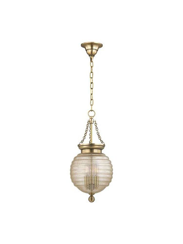
In the front bay window, again, we have a pendant light. This is a little accent light and also for sitting in the front window reading or looking at the tree (since you can no longer see anything but the tree when you look out). It had to have a flexible cord so it could be looped out of the way when we put the Christmas tree up, so I chose this Coolidge small pendant from House of Antique Hardware. I like how it picks up some of the round and fluted elements from the chandeliers.
From the parlours you will now see the dining room chandelier. The big rearrangement we made to align the dining room with the parlours means the lights will all be aligned with each other on one axis. So the light in the dining room had to work with the ones in the parlours. But for the dining room I wanted a more elaborate light, something more romantic and overblown.
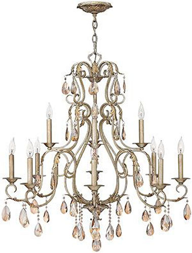
I chose this Carlton chandelier from House of Antique Hardware. I like how it is a warm silver, the simple crystals, and the overall shape of it. It can also be looped up when we want to move the table out of the way (ours will be on a longer chain than shown here because our ceilings are so high).
It's a pretty wide chandelier, but when I overlaid it on the dining room and the table we have, it works perfectly. Choosing the right chandelier is a lot about scale.
In the hallway we decided to work with a theme, which is reproduction gas lights. The light style we used for the hallway sconces has been discontinued, which was a major letdown, but I found these gas fixtures that work well and you can have different kinds of fixtures with different finishes if they work together.
This is the light that will be in the back hall, by the relocated side door:
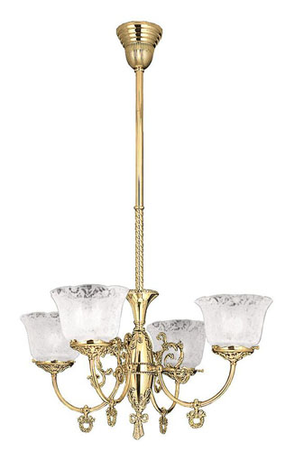
('m going to get different glass globes for it, but I'm undecided. My instinct it to go simple with a plain frosted glass globe, but this fixture may want something more ornate.)
At the front entry, a simpler fixture that will be visible through the arched window:
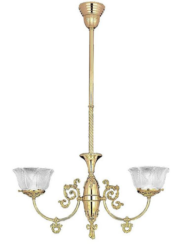
We also need less light in this location because nobody does anything complicated by the front door.
And upstairs in the hall over the stairs, the larger version of the same light:
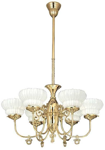
Right now, this is fluted melon shape is the globe I'm leaning towards if I do something more ornate.
These are all from Vintage Hardware and Lighting and don't have cutesy names which is all the more endearing.
Moving along, the Accordion Room is becoming a bathroom with a clawfoot tub and some flamboyant wallpaper for those who cannot stand a Victorian house without at least one Victorian room (no wallpaper on the ceiling, though, because I can't handle that). This room had a fire hazard of a light fixture when we moved in, which we took out and replaced with a simple ceiling light. Now I'm replacing it with a mini chandelier:
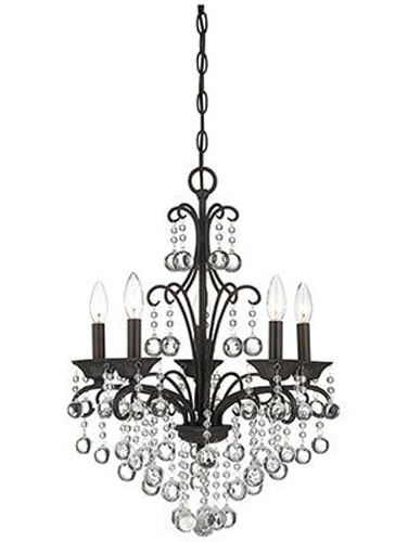
This is the Carrabelle mini chandelier from House of Antique Hardware. The room is decorated mostly in black and white with chrome fixtures, so this worked really well. I'm not sure why I have been on such a black-and-white bathroom kick lately but it might be something I should take a look at.
Over the sink we need a sconce, and with not much other light in the room I wanted something fairly bright. So I'm using this:
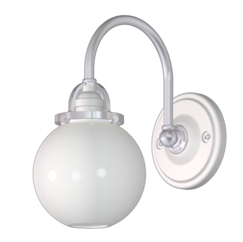
It's a customization of the Mist sconce from Rejuvenation, with a white porcelain, chrome, and a frosted globe (so we can use a non-decorative lamp in there).
In the middle bathroom, the style is a little more modern, and we have only one non-can light fixture:
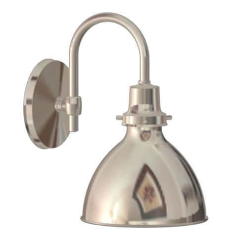
It's the Eastmoreland sconce, also from Rejuvenation, in polished nickel with a nickel shade. The middle bathroom has can lights above so the sconce is more for lighting your face up and for decoration. I've actually been planning to order this for a long time, and once we decided to have the contractor finish up the bathroom I put off doing it because stuff sitting around waiting to be used is stuff that can get damaged, broken, or stolen from the job site. But now it is time.
(Sorry for the crappy pictures of those two; they are from Rejuvenation's customizing software which does give you a decent idea of what you are buying but results in a somewhat fuzzy photo.)
In the back bathroom, most of the light comes from either the can lights, or the skylight, or the LED cove lighting inside the skylight (I'll get into that in another post when we have some construction photos). So I chose these sconces:
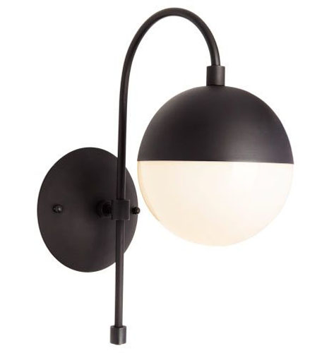
I am actually NOT doing an entirely black and white bathroom here, but the sconces just go well with the midcentury look I'm working around in here. These are the Cedar and Moss sconce from Rejuvenation. Also available in brass, but the fixtures in the back bath are chrome, and that's a metal mix I think looks lazy.
Some other lighting that is decided on (it's not all nailed down, shockingly, even though I am ordering everything this week) are the exterior sconces for the deck:
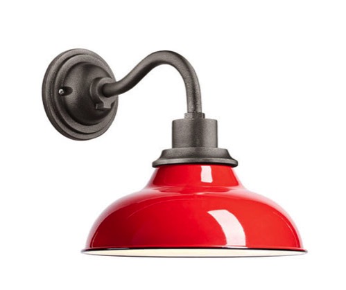
This is the Carson sconce from Rejuvenation. I have used this sconce on about five projects and I love it. We went with the red because it's a fun colour and what the heck. I don't see myself hating it but if we do a new shade is not ruinous.
In the bedrooms where there will be full-time residents, which is to say our bedroom and the bedroom for my parents, we are installing bedside sconces for reading.
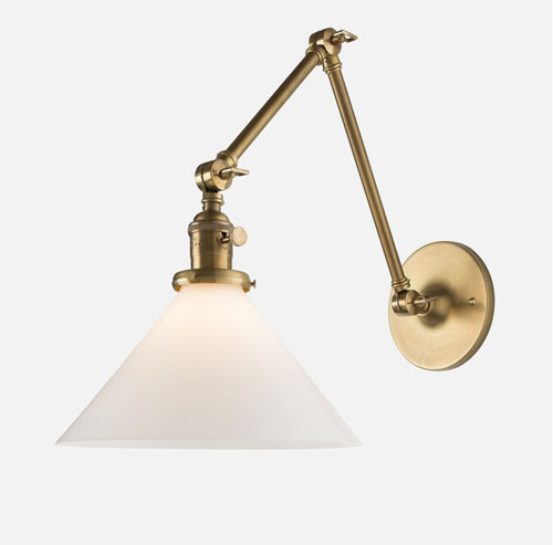
These go in our bedroom, which will have some kind of brass pendant in the middle of the room, too, should I ever decide on that one. They are the Princeton sconce from Schoolhouse Electric. I like an articulating light for reading in bed because I can move it around depending on what position I am in. I know it's not good to read in bed for sleep quality, but whatever.
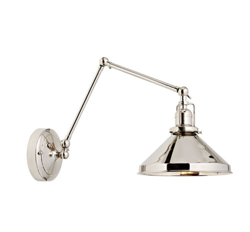
These go in the back bedroom. This is the Imbrie sconce from Rejuvenation. I am my mother's daughter and there is no way I would not put reading lights in her bedroom, too. There is no ceiling light in the back bedroom because it has cans and the most amazing windows in the house. I guess if I regret that later it would be trivial to go up in the attic and drop down a junction box, but I think there is going to be plenty of light there.
And that's the fixtures I've chosen so far (and mostly ordered, though not all of them because I had a bunch of decisions to make about them this weekend). I still need to choose a pendant for the bay window back bedroom (I think of it as Bedroom 3 which is a little undescriptive) that will go in the bay window, plus pendants for the front bedroom and our bedroom. I have a fixture to go in the front bay window upstairs, but no photo. I'm also choosing landscape lighting for the front stairs, side stairs, and walkway, and at the same time pondering other landscape lighting at least in terms of future capacity if not actual fixtures.
I should note here that I am enjoying a nice trade discount on fixtures, and in some cases they sell to me at a wholesale price which is even more attractive, but other than that I don't get any kind of benefit from buying from these companies, and I'm pretty sure none of them know I wrote this post. I just don't like the compromises you make in taking advertising, so we don't do it; other people make different choices about this and that's fine for them. Anyway, just to make that clear. I have ordered lots of times from Rejuvenation and Schoolhouse for clients, but for everything else I'm taking a bit of a chance and will let you know how things come out.
posted by ayse on 09/17/16