Much Ado About Tile
Tile is one of those things that we get into trouble with all the time in my office. The thing is, some tiles are just sitting around in a local warehouse, waiting to be bought, and others have really long lead times. So you want to order tile early, but then you have to store it. If you order late, you may not get to use the tile of your choice.
And yes, it's usually possible to find a very good alternative, and knowing how to do that is part of being an architect who does residential work. But still, there's always this sadness for the one that didn't fit the schedule.
So I'm getting tile lined up now. Drywall will go up in a couple weeks, so 4-6 week lead time for tile brings us to right about NOW.
We are actually not using that much tile. There's the floor of the front bathroom, the floor and walls of the middle bathroom (for which the tile is already on site, getting in everybody's way), the floor and walls of the back bathroom, the floor of the kitchen and pantries, the kitchen wall behind the stove, and the wall behind the sink in the dish pantry.
So let me show you what we chose.
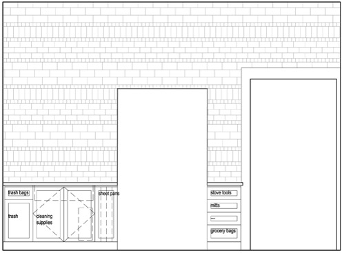
The kitchen wall is a pretty significant feature of the renovated kitchen, so I spent some time making it both interesting and also not too insane (because I care about your eyes). I went through a couple of iterations on this, starting with plain subway tile, then adding a texture row of 2x2 tiles, then working out this more complex pattern. The tiles will all be the same material, and the grout closely matched, so the pattern is more for texture.
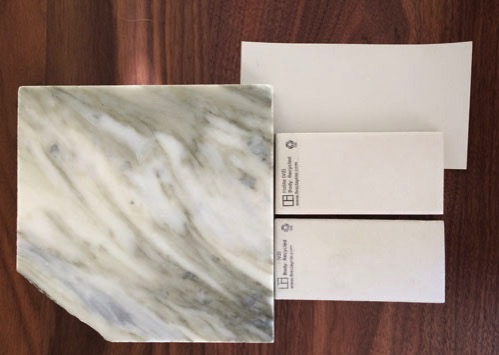
The tiles I'm using are from Fireclay tile in Halite, which is a matte taupe tile that works very well with our wall colour.
You can see the sample pieces above with a sample of the marble for the countertop and the paint swatch. (The background is our new dining room table.) I like Fireclay Tile for a couple of reasons. First, they are handmade in Santa Cruz, which is local-ish (and very rare). Second, because they are handmade they have variation in colouring, which gives a lot of depth to a wall even when it is just one colour. They make your tile to order (most of the time; they do have some stock tiles), and have a great variety of sizes and shapes available, plus some custom handpainted tiles if you want a more patterned look. These particular tiles are on a recycled clay body, too, which is always a bonus. Plus they have great colours. If you are local and looking for tile, their showroom in San Francisco is open weekends which is pretty rare for businesses that are mostly to-the-trade.
For the floor I chose a less fancy tile.
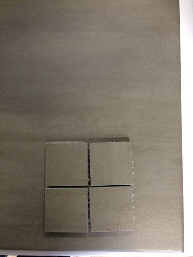
This is Koshi, in colour "cemente." I'm ordering this tile from Tileshop in Berkeley, where we often buy tile for projects at work, in part because they have lots of tile just sitting in a local warehouse rather than ordering it on purchase (with long lead times). In fact, this is the same tile we used in square format (and different colours) on the side porch. But for the kitchen we are using 12x24 large format tiles, and in the pantries we are switching to the 2x2 grid tiles.
We have used this tile a lot for projects at work because while we like large format tiles for the main floor, the 2x2 grid is good for shower floors where slipping is an issue (the extra grout lines provide traction). Plus it's a coloured body porcelain, which means that it doesn't show red or white if you cut it, just the same colour as the finish. Plus, the cemente is a nice warm gray.
The same tile will be at the back entry floor (in 2x2 again for slipping) and on the floor in the laundry area upstairs. Because there's no need to have a hundred kinds of tile when you are using it as a utilitarian floor surface.
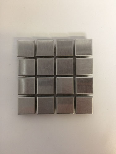
This backsplash tile is for the pantry. It's a discontinued stainless steel tile from Ann Sacks. I found the sample in our drawers at work and when I called to price check it, they said they had 550 square feet left and it was 50% off my usual trade price. Yay for having tastes that are going out of style! Alas, you can't buy it if you love it, so too bad.
The squares are 5/8" on a side, so it's a smaller tile, which works well in a smaller space. The metal will shimmer from the under-cabinet lighting.
I got the inspiration for this from this photo:
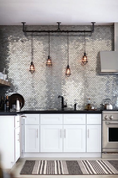
(This image is all over Pinterest, but I can't find a source even with image search, so if you know who the designer was, let me know and I will update this.)
In the pantries, where there isn't going to be a lot of natural light, this is a nice option.
Moving upstairs, in the Accordion Room, we are using a stone mosaic tile from the Riverside Drive collection from Artistic Tile.
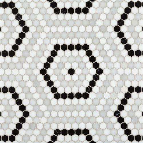
The Accordion Room, you may recall, is becoming a more traditional bathroom with a pedestal sink and a clawfoot bathtub (that is currently giving our plumber fits because the installation information is very vague). This tile reminds me of a variation on the traditional hexagon bathroom tile you see all over the place in the northeast.
There's no other tile in that bathroom; just wooden wainscoating and either wallpaper or stenciling above, depending on what I decide on in the next few weeks.
I'm going to skip the middle bathroom because I don't have any photos of the tile. It's black and white stripes on all four walls and everybody is going to hate it but I love it.
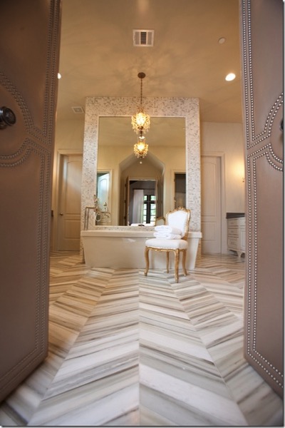
In my parents' bathroom we are using this chevron tile on the walls (in general, any tile you can use on a floor you can use on a wall, but not vice versa). It is from Walker Zanger, and it is Helsinki "Silver Mist" in the chevron shape. This is a stone tile, which is to say it is a thin slice of stone cut to shape, which gives it the look and feel of stone, without the pain of hanging a massive slab of stone on the wall.
This is a ridiculously popular tile right now, usually out of stock and backordered, but worth the wait. When I emailed the rep about it they told me it would be available in late December. Worth it.
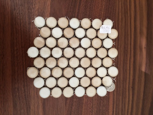
For the floor, we are using these penny rounds from American Universal. We use penny rounds a lot in my office, and there's one particular style we used so much that we had to institute an office-wide moratorium on using them lest we become known as the blue penny tile people. We get them from American Universal in part because they are in Hayward (just south of us) and have stuff in stock. But mostly because they have a bunch of great colourways that work really well.
This one is one of my favourites, and it looks great with the Helsinki tiles. Plus, I love penny rounds. As a bonus, penny rounds work really well in showers because they can be molded to work with the slopes required for drains, and they have lots of grout lines so even high-gloss tiles will have plenty of grip.
posted by ayse on 10/15/16