Bathroom Tiling
This started with a post that I wrote out to post while we were away, which then did not post because when I thought I confirmed it, we were suffering through some very iffy wifi in the Japanese Alps. Yeah, life is rough.

Here's what the Japanese Alps look like. We climbed halfway up this mountain to this scree slope, and this is the view up to the top (where there is a little shelter you can reserve, and if it is like every other remote place in Japan, five bars of data coverage and a vending machine). We decided not to climb any further that day because we had not brought ice hiking gear with us. Also, it was getting on for lunch time and we had a bus to catch. At any rate, the wireless signal up on the mountain was just fine, but down in the valley my ipad was having trouble connecting. This was my first big trip in... maybe 15 years? without a laptop to do nightly image dumps, and there are clearly still some kinks to work out. So you got no post and I have this out of date post to update.
So back to the house. More tiles.
The tilers have avoided the fate of the roofers (cardiac event, doing much better now), and also the fate of the scaffolding guy (double stroke, poor guy, I feel for him), which means the house is satisfied with its blood meal and we need to get this job done fast before it gets hungry for another contractor.
Erm, sorry, maybe that belongs on my secret construction-themed horror fanfic tumblr.
The Accordion Room
How about this fine mortar bed?
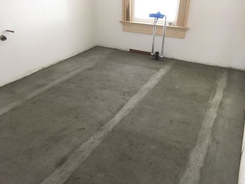
That turned into this fine floor:
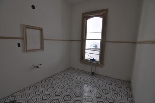
I'm very happy with how this floor is both very traditional and also not blah blah boring traditional. This is a marble tile from Artistic Tile, and it comes in this grey version and also a black, but I find the black a little too contrasty for this room. It depends on what you are looking for. I wanted a hex tile with a neat pattern, was pondering a black and white border pattern, and then this popped up on my radar. Sold!
The Laundry Closet
Here's another exciting mortar bed that turned into a floor:
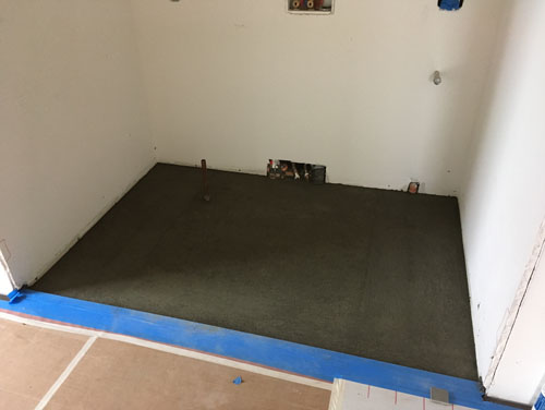
(That'll be the laundry closet.)
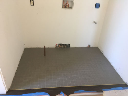
Most of the grey tile for the utility areas is covered up with paper for protection right now: it's in the back entry, the kitchen, the pantries, and this laundry closet. The laundry closet, being out of the way, is not covered, so there you go.
You can see the copper drain for the washing machine drain pan popping up. Washing machines on upper floors should always have a drain pan to prevent really hideous water issues. Also, remember that washing machine hoses have a life span of about five years and should be replaced before they burst and destroy your home. Even if it feels like dropping $20 replacing what feel like perfectly good hoses is a waste, imagine how expensive repairing extensive water damage will be.
The other thing you can see in this photo is the transition between the wood flooring and the tile.
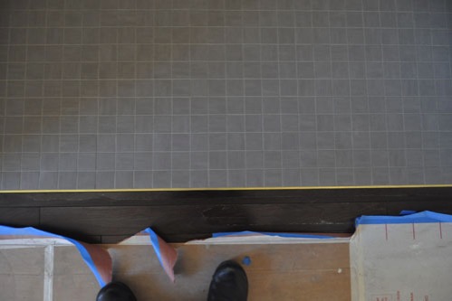
Here's a little more detail. This is a simple strip of brass. You need some kind of edging between the two materials, because they handle moisture differently. I like the nice clean line of a metal edging at the tile rather than a nailed-on cover strip.
The Middle Bathroom
And now we have the way I knew that the post hadn't gone up as expected:
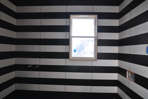
This is the finished tile in the middle bathroom. This is beautiful. I spent ages designing it and worrying over it and then was super fussy with the tile contractors, but it was 100 percent worth it. I know it's too busy for some people, and that this is sure to inspire some angry emails and comments about how I am destroying the entire world by having a visually stimulating bathroom. Chill, folks. It is a small bathroom that you literally never need to step foot into. Unless you are Noel in which case SORRY, you knew I was this way when you married me.
I love it. Let me show you how.
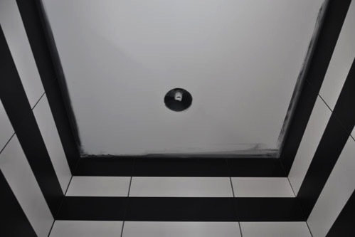
Here's how the tile meets the ceiling. For background, this tile comes in pieces that are twice this thick from top to bottom, so I made those poor tile contractors (the ones I am trying not to have my house destroy!) cut each piece in half lengthwise. I wanted the tiles to lay out so that the top row was a full tile, which if you have never tiled a wall is a HUGE pain in the butt.
Normally you start at the bottom and every subsequent tile is set in on the row below. These guys did that, of course, during the actual installation, but to get everything the right height so that the wall would end with a full row they had to lay out the tiles in the bay window bedroom from floor to ceiling, row by row, with a template of the floor slope there to guide them. This bathroom is a masterpiece.
The ceiling will be painted a bright red. Because red is the hardest colour to paint and I am going to try to kill every contractor.
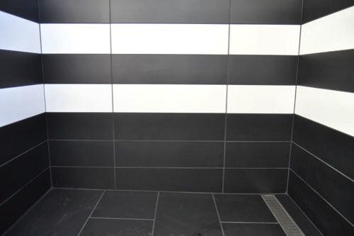
The bottom was three rows of black tiles to make a dark basin at the floor. When you have a really strong pattern, one way to pin it down is to ground it on a base, sort of creating a pedestal for the pattern to land on. The black tiles floor does that for this room. I feel like it really grounds the pattern.
Flawless.
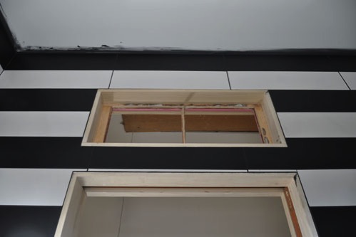
The trim around the windows and door is flush, 3/4" wide, and will be painted high gloss white. I love this bathroom. It is the little crazy jewel box I wanted. With some wood shelving for soap and orchids, it will soften up a little, but not too much.
The Back Bathroom
I'm replacing the photos I had of tile in progress in the back bathroom completely. The in-progress photos are fine but they're also a big whatever compared to the finished photos.
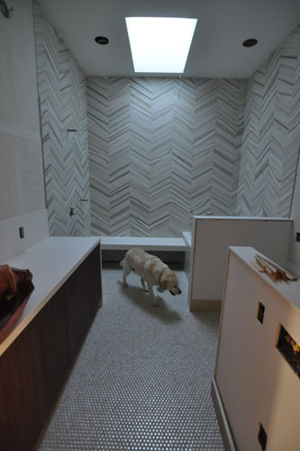
The tile I chose for the back bathroom walls is lovely. I love it. It's a stone chevron pattern (distinguished from herringbone because the stones don't interlace at the ends, so there is a straight line between stacks of V's) and it is a great warm marble colour and yet still a little dramatic. It's from Walker Zanger it tends to have a pretty long lead time, but is worth the wait; just give yourself a couple of months to get it and you will be good. Perfect for a modern luxurious bathroom. Walking through with the contractor today he remarked that the room is just calm and relaxing, which was what I wanted. A bit of a spa feel without taking up as much space as a bedroom.
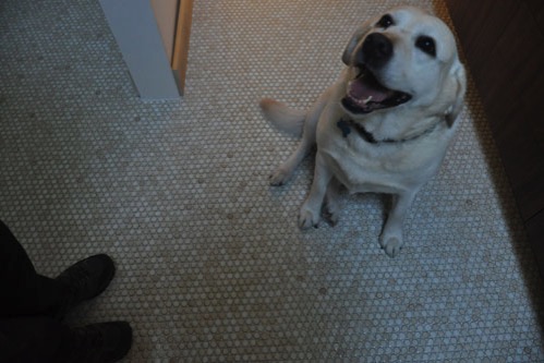
I did penny tiles on the floor because I love penny tiles. BUT. The thing about penny tiles is that they can be a little challenging to install. If your installer doesn't have a lot of experience, you can end up seeing the lines of the square sheets the tiles come in telegraphed all over the place.
When they're installed well, they are a dream, though. With lots of grout lines you get grippiness (what you need on a bathroom floor), and I like the soft pattern of the variegated colourway. They work well as a backdrop to the more dramatic wall tile. Plus they match the dog which is always a plus since somebody had the great idea to put in dark walnut flooring in the rest of the house.
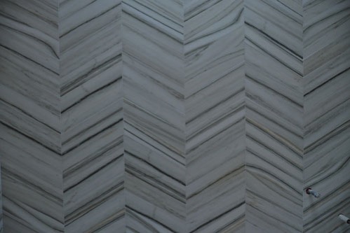
These are the wall tiles. Photos don't really capture the depth of a real stone tile. The range of colours is wider than the camera can capture, even on the nice big camera. The colours here go from a warm white to a warm dark grey, and there's both drama and softness.
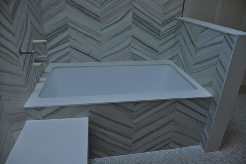
I had enough tile to do the tub surround in the same tile, so why not? I gave some serious thought to just running the floor tile up the side of the tub, but in the end decided that wasn't really what I wanted.
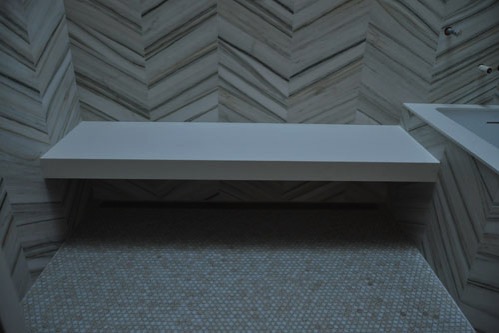
Another neat little detail: the shower had a linear drain that is concealed under the bench. I've done this a lot and it's a great way to hide a feature than can be kind of eh or even jarring. In the middle bathroom we splashed out on a fancy linear drain and have it exposed, but in here we went simpler and the drain is basically out of sight. That does mean you have to be more proactive about clearing hair from the drain, by the way. We'll live.
And with that I think I've caught up on getting all our pre-written posts updated and posted.
posted by ayse on 06/08/17