More About the Kitchen Tile
I'm pretty happy with the tile backsplash in the kitchen, having seen it in a bunch of different conditions. (Note, I added a couple pictures to this post after initially posting it, because I found where my phone decided to try to hide them.)
For some background, the tile is made by Fireclay Tile, which makes tiles to order in their workshop in the central valley. They're a little more expensive than everyday subway tiles, but I wanted a couple of things:
1. Not too shiny. This wall faces the bay window that faces west, and in the afternoon sun just pours in here. I didn't want a shiny reflective surface to make my life miserable every evening.
2. Subtle colour. I didn't want plain white, but I didn't want a bright colour here. I'm a huge fan of colour but with purple cabinets I felt like the wall needed to take a step back. Also it is twelve feet tall and to not look unfinished I wanted the tile to the ceiling.
Fireclay had a tile I liked and also made the shapes I wanted, because this is what my design looked like:
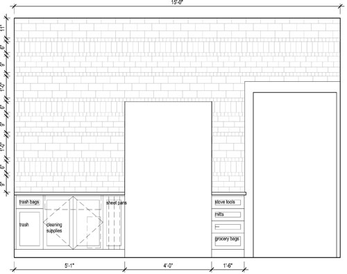
The design is made with three sizes of tile: 2x2 squares, 3x6 subway tiles, and 4x8 subway tiles. The 3x6 subway tiles are either in a running bond or a vertical soldier course, so it looks like more kinds of tiles.
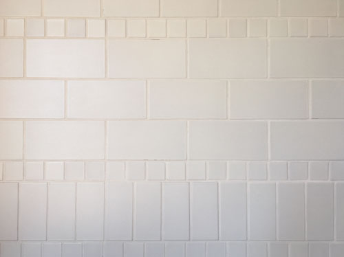
The idea with the pattern is to make a subtle texture on the wall, like a Gansey sweater.
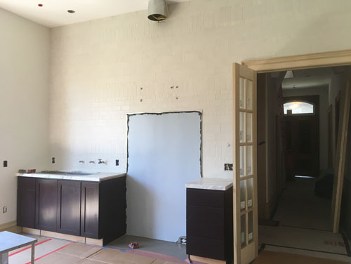
Here it is in indirect light:
And this is what it looks like with the wide angle lens from across the room, later in the day when the light gets a little crazy on that side of the house:
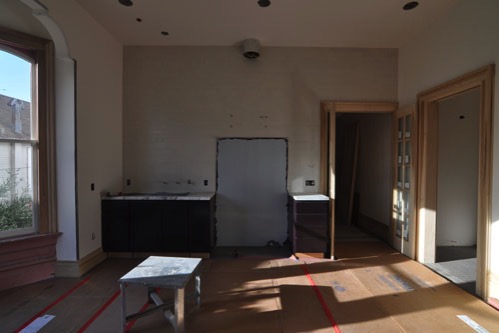
The kitchen walls and ceiling will eventually be painted a colour very similar to the tiles.
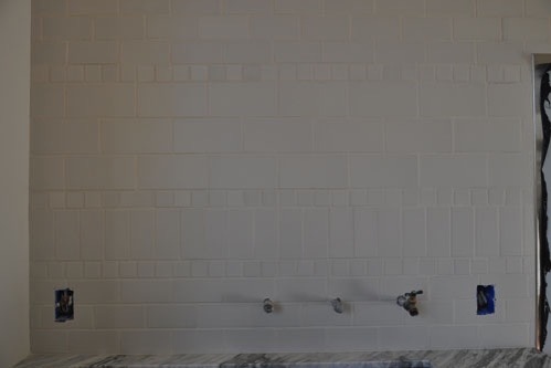
Here it is a little closer up. Because these are handmade tiles, and they are designed to have subtle variation in colour, the wall kind of subtly moves and looks different colours as you move around and as the light changes on it. Some tiles look very dark while others are shinier and for others, you can see glimpses of the red clay body.
The light grout kind of blends the whole thing together, which was the idea. I'd originally considered a dark grey grout, but decided I didn't want the wall too busy. I guess if I change my mind I can regrout, or stain this grout. But right now I like the light grout.
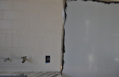
Behind the stove we put in a stainless steel backsplash because it's easy to clean. The surface is set about flush with the tiles, and runs down to the floor. When I do a stove wall I like to include a cleanable surface for the backsplash all the way to the floor, because I have pulled the stove out to clean behind it and suffered through scrubbing drywall sticky with grease from frying. It is no fun. Easy-clean surfaces will make your life a lot easier. Plus it looks cleaner and more finished.
We're starting to inch towards completion at long last.
posted by ayse on 06/05/17